Work is what binds us together -- more specifically, the commute to work. That's the theory that two researchers have used to tackle the tricky challenge of defining the Front Range and other "megaregions."
A megaregion is a cluster of cities. To show the connection between those cities, the researchers crunched through U.S. Census data about millions of people's commutes, turning it into a national map of how people travel to work.
Here's Colorado:
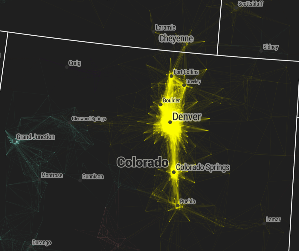
The brighter lines represent a higher number of trips between two points, symbolizing the strength of the connection between the areas. As you might suspect, it's a total free-for-all between Denver and Boulder. As you get out farther, to Cheyenne and Pueblo, those lines start getting thinner, and they branch deeper into rural areas.
This map also illustrates just how lonely the Front Range cities are. Other areas of the country are densely packed, one region against another, as you'll see further down, while Denver is surrounded mostly by nothing. (Of course, a population map would show you that too.)
I also noticed that the Front Range connections bridge a relatively long distance, about 215 miles by car from Cheyenne down to Pueblo. On the East Coast, Charlotte and Raleigh are separated into two different regions despite being less than 200 miles apart -- perhaps because they're similar in size and influence, making it silly to drive from one to the other just for a job. In Colorado, meanwhile, Denver is the undisputed center.
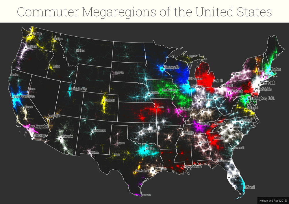
This might seem like pretty obvious stuff. If you've lived here long enough this map does nothing but confirm your suspicions. But I find it intriguing because it illustrates those intuitions so well -- and with a new level of detail that could be useful to urban planners as transit better connects our cities, as this National Geographic story argues.
Of course, this is just one of many ways to try to interpret a subjective question, and it occasionally spits out some wonky results. For example, as Twitter user Mateo asked me, is southwestern Colorado really connected more to Albuquerque than to Denver? The transit data may say so, but that also ignores larger factors, such as, say.... both being in Colorado.
The researchers were Garrett Nelson of Dartmouth College and Alasdair Rae of the University of Sheffield, and they published all this in the open-access journal PLOS ONE.
Now, more maps:
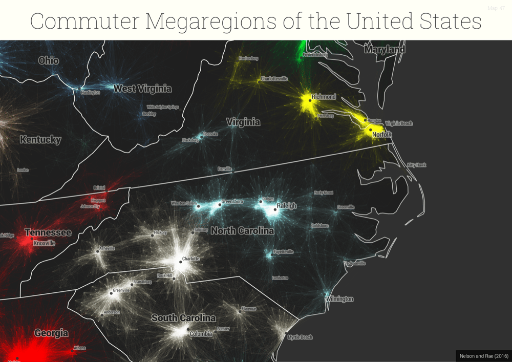
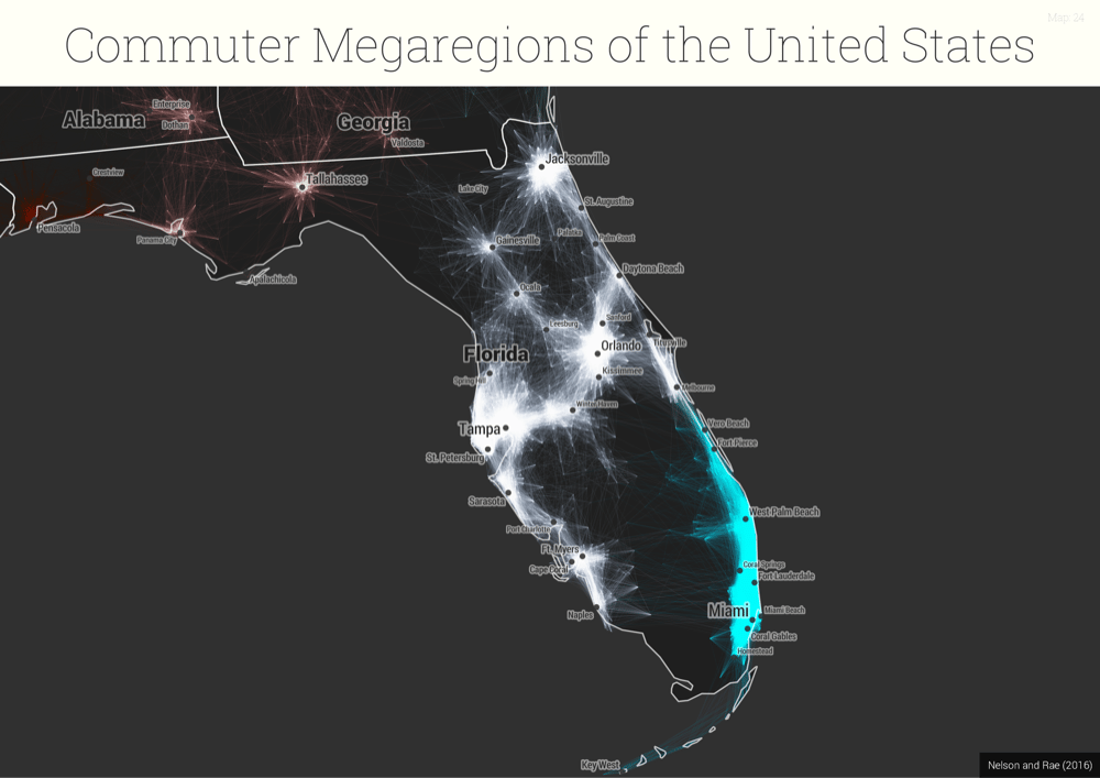
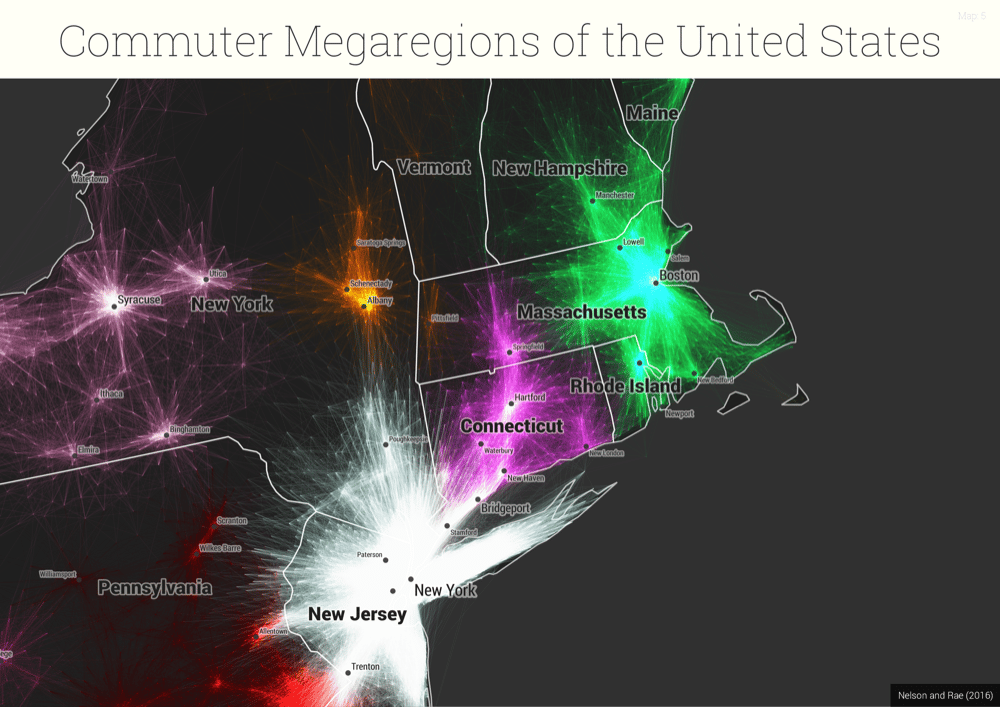
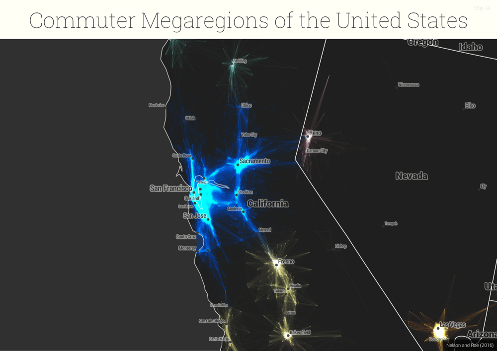
If you want to look through a bunch more of these, they're openly available.


