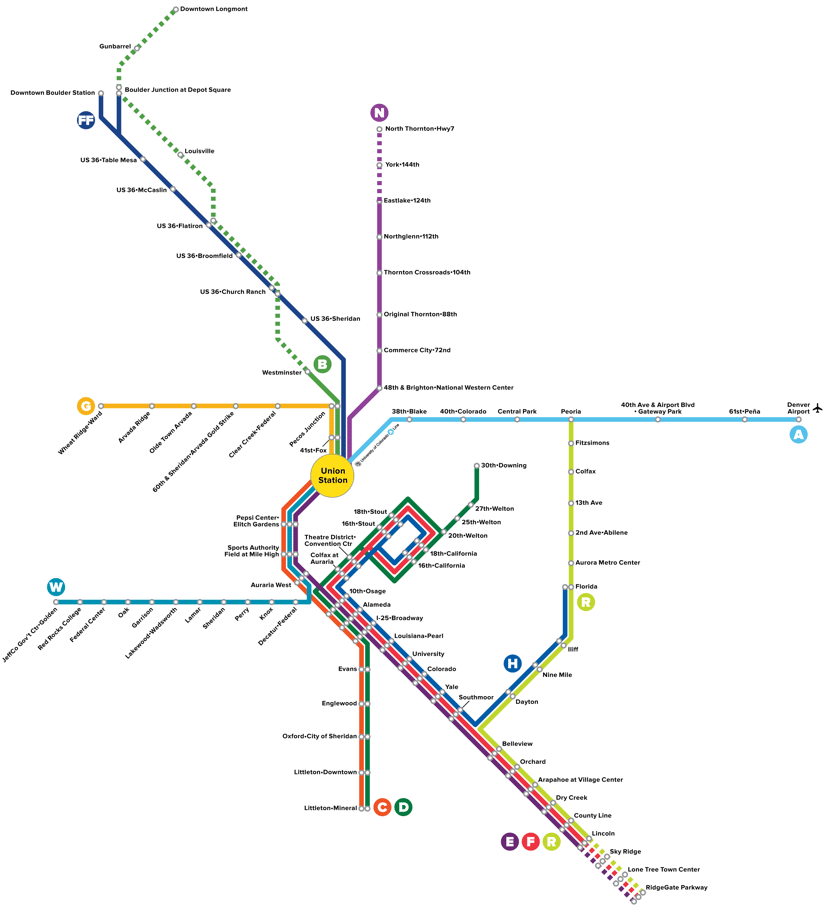
It probably looks familiar, but the above is RTD's new system map.
In most ways, it looks similar the rail system map that we're used to. Which is why Denverite Editor Dave Burdick thought it was weird that there is a bus line (FF) on this otherwise rail-only map. I agreed, but here is RTD's reason why:
RTD spokesperson Nate Currey says this new map is not meant to be a solely rail centric map. The FF line (the Flatiron Flyer) is there because it's the system's first bus rapid transit corridor, he said via email.
Currey further said the old map, while geographically accurate, was hard to display well with different dimensions.
"So a more subway-esque transit map that isn't constrained with geographic accuracy allows for design flexibility as our system continues to grow," he said via email.
Expect to see a horizontally designed version of the map in all of light rail vehicles and throughout the system soon.