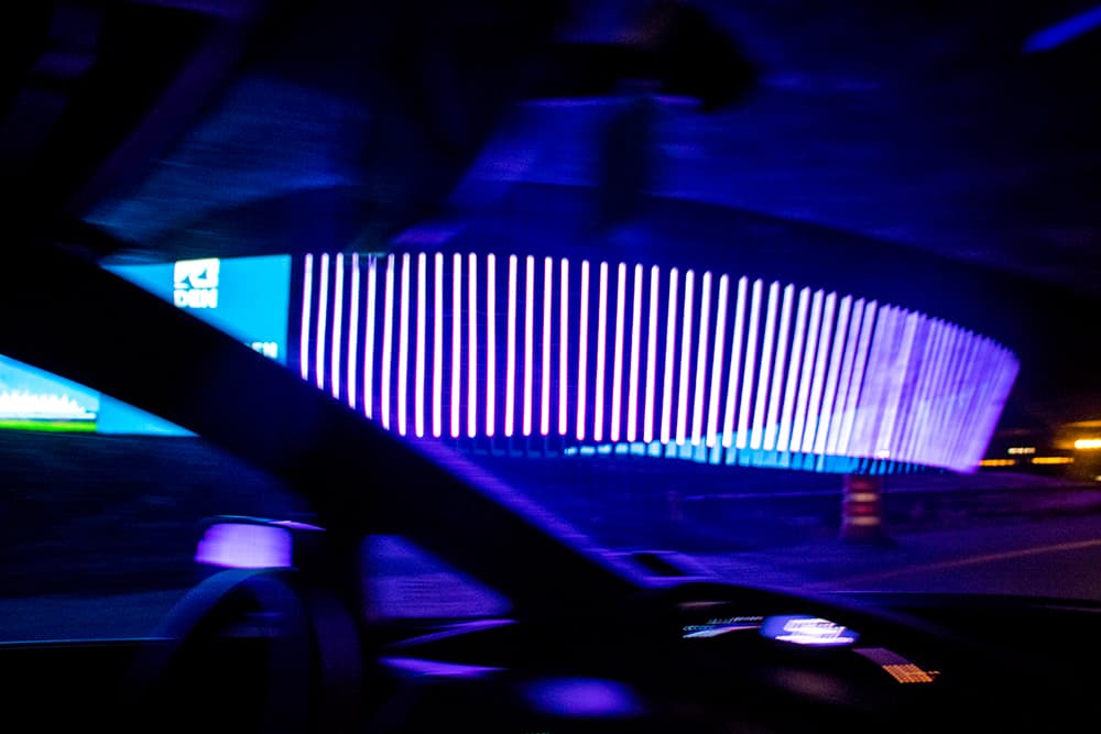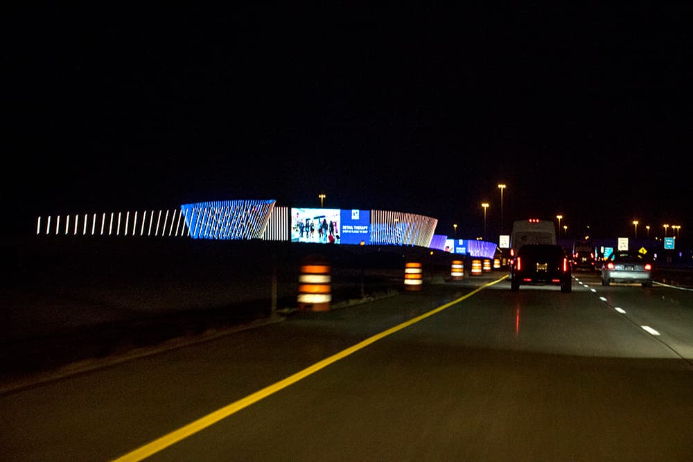
You see it first as a pulsing glow in the distance, neon light seeping out across the roadway as you approach Denver International Airport.
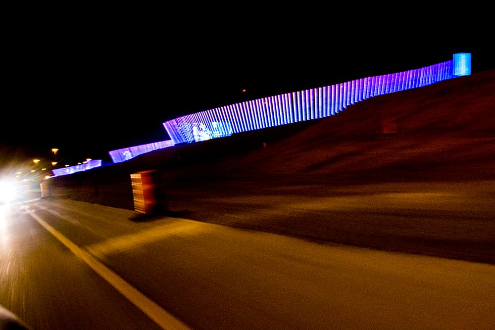
Up close, the source reveals itself: a densely planted fence of illuminated poles, snaking a thousand feet along the grassy median of Peña Boulevard.
This is the public airport's new welcome sign, a sight that an airport executive promised would be "truly magnificent and iconic."
Installed at a cost of $15 million, the sprawling LED display has drawn some criticism as a perceived extravagance, but airport officials claim it's a sound investment. They say they'll make the cost back within a decade by selling advertising on the large screens interspersed among the poles.
It won't be totally done until Christmas -- it still needs some landscaping and physical lettering -- but it's been illuminated for a few weeks now. So far, the reviews are mixed.
Some commenters have decried it as a waste, and others as a distraction. "My god, why is it so bright!" one Reddit user wrote.
Another claimed that they were "totally night blind and just plain annoyed" after passing the thousand-foot installation. Yet another decried it as "really distracting."
And why do we need a river of light when we have a demon horse, asked an_internet_dude?
Others were more positive. "I... like it," wrote microbae.
Our impressions:
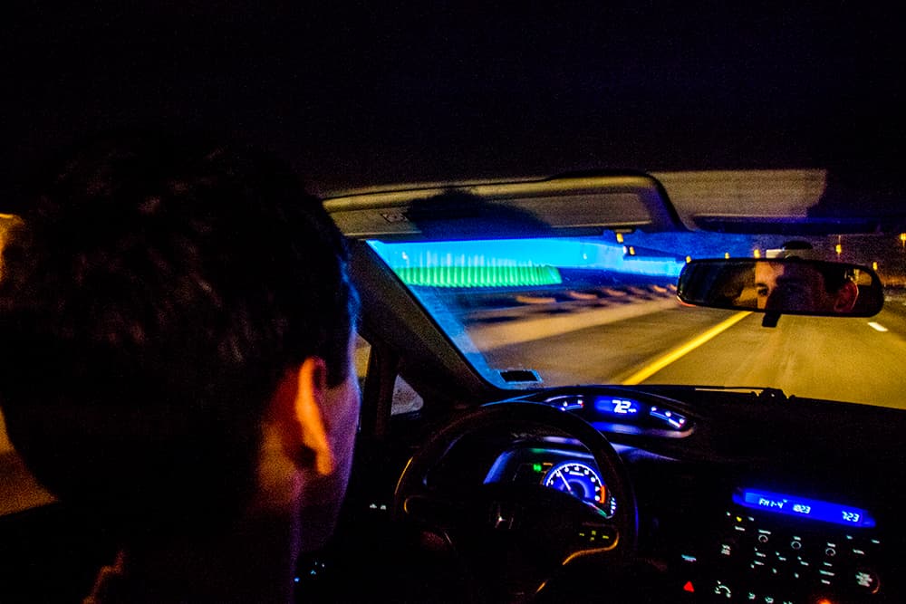
We were especially curious about the claims that it could cause night blindness, so our photographer, Kevin, and I took a drive to see for ourselves.
Neither of us found the sign to be particularly bright. It didn't seem any more luminous than the headlights, brake lights and streetlights illuminating Peña. And while the colors do slowly pulse, I didn't find them distracting.
However, I do have pretty good vision. I could see that this might be a pain for my parents, and some commenters have specifically complained that it's easy to miss the poorly lit exits right after the sign.
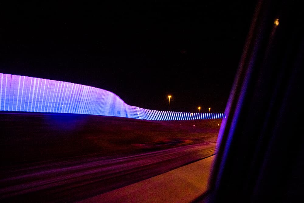
Airport spokesman Heath Montgomery said that the sign was "built to meet all highway safety standards and is in compliance with industry standards." He added that Panasonic -- the tech company that built it -- will continue to tweak the sign's settings.
I did find myself staring at the display screens interspersed along the installation. Right now, they're advertising the airport itself with phrases like "Retail therapy," "Stress less," and "Wander often."
Eventually, they'll carry paid ads from outside groups, although airport rules will forbid “political, religious and controversial content.”
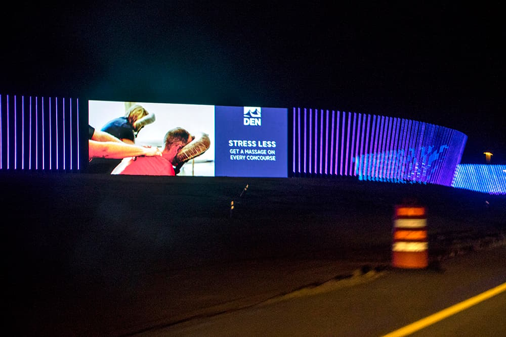
As for the design itself -- well, I'm not an art critic. It's a technological feat that simply wouldn't have been feasible until fairly recently, but it's not exactly Blade Runner either. In other words, it seemed a little dinky to me.
Could this money have gone somewhere else?
Fifteen million dollars is a lot of money. It's about how much the city will spend per year from its affordable housing fund. And it's more than the airport expected to spend, thanks to some trouble with pesky federal regulations.
However, airport officials defend the spending in two ways. First, as mentioned above, they expect to make their money back. And it's worth noting that the $14.5 million price tag also pays for Panasonic to maintain the sign.
Second, this isn't "taxpayer" money. While Denver International Airport is a part of the city government, it's an "enterprise," so it's not funded by sales and property tax dollars. Instead, it makes nearly $1 billion per year from concessions, airline fees, hotel operations and more.
And the airport is limited in how it can spend that money. The money is generally supposed to go to the "administration, management, operation and maintenance" of airport facilities, according to city law.
Does that include a thousand feet of lightsabers on the front lawn? Apparently so. The Denver City Council approved the final contract for the project earlier this year.

