So I got kind of obsessed with Megan's chart of the week this week.
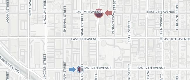
The chart is about where B-Cycle users start and end their trips.
See, I'm a B-Cycle user. I finally have a bike of my own, but I'm still addicted to the service. I used it for a long time instead of buying a bike because the annual charge was less than a tune-up (it's not now) and much less than buying a used bike and having it tuned up.
Megan found that most B-Cycle stations have roughly the same number of check-ins as check-outs. Sure, they probably happen at different times of day, but in a way that's still kind of remarkable.
But take a look at the map again. The circle at 9th and Logan is more red than blue. That means there are more check-outs (people starting their trips) than check-ins (people ending their trips).
The circle at 7th and Grant is more blue than red. So more people are ending their trips there than starting their trips.
Here's the image one more time.

Take a guess why one has more check-outs and the other has more check-ins.
I'll throw some of Kevin's delightful gifs in here while you think.



OK, ready?
Here's the difference -- according to me and no one else, meaning I could definitely be wrong: The one on 9th, where people start more trips than they end trips, is uphill from the one on 7th. You're more likely to coast down to the one on 7th if you're headed south. But if you're walking to your B-Cycle for the morning, you might as well start at the one that's already up a hill.
Why would I know that?
I was guilty of doing it myself when I lived over there.
And it reminded me of the perpetually empty (or nearly empty) B-Cycle dock at the top of University Hill in Boulder when I lived there.

I see another spot like this at 32nd and Tejon, in addition to the one Megan found on Larimer. What else do you see on this week's chart? Let us know.

