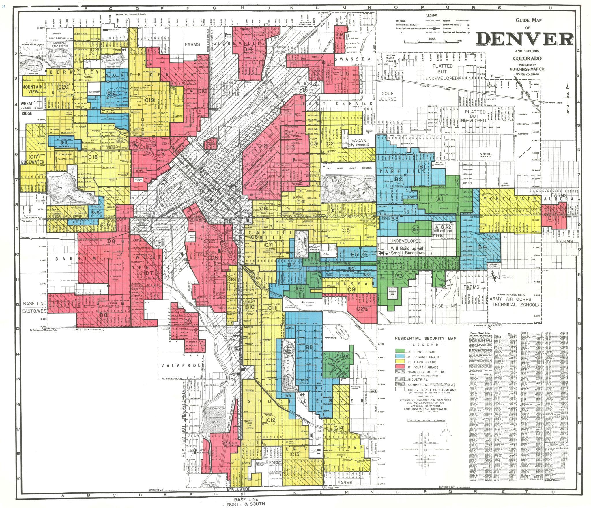
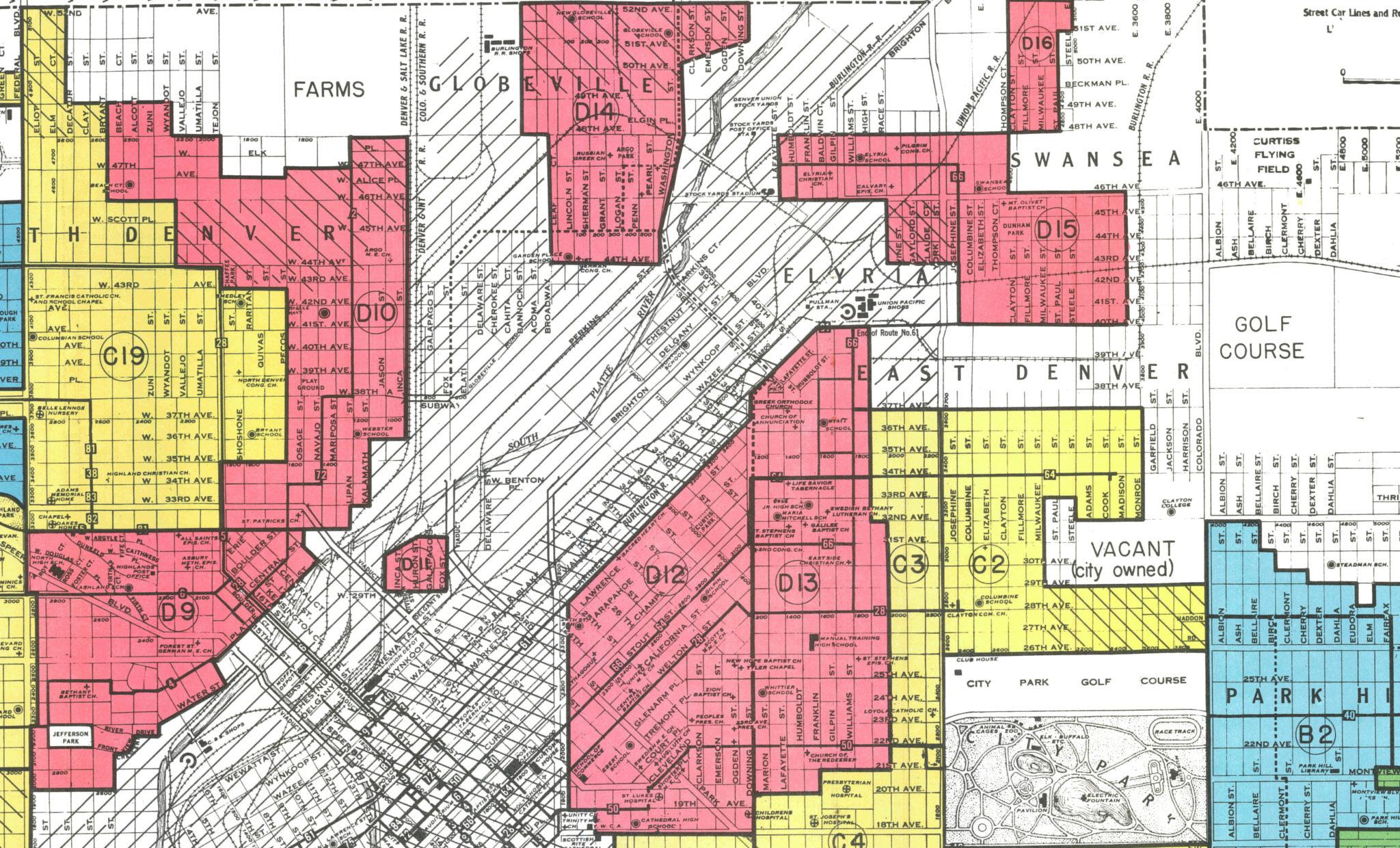
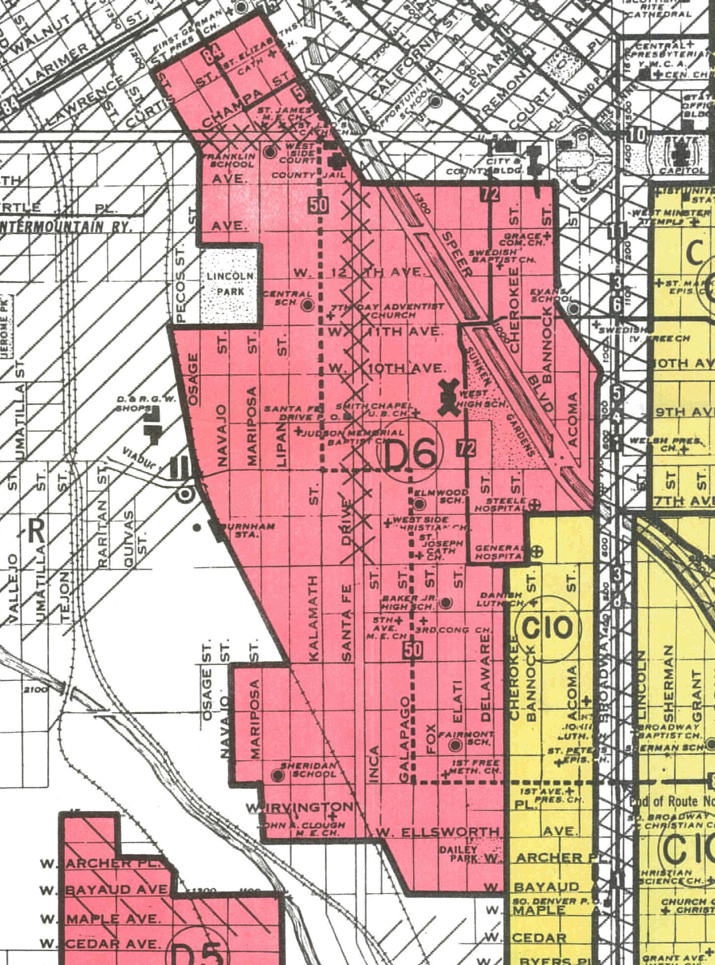
The most striking thing about Denver's 1934 Residential Security Map in one respect is just how much smaller the city was back then.
Or maybe that's just because I find it to be a relief that large parts of the city we have today weren't subject to this practice.
Residential Security Maps were a tool used by the Federal Housing Administration to decide which homes got mortgages. Neighborhoods with white people were favored; neighborhoods of color were definitely not.
The colors on the map represent a spectrum, with green being the most desirable, followed by blue, yellow and then red. Homebuyers could not get a mortgage in the red areas.
Using Mapping Inequality, a project that's made RSMs accessible by laying them over current space projections, we can look into the practice known as redlining.
Ta-Nehisi Coates has said, "Redlining destroyed the possibility of investment wherever black people lived."
And the legacy of redlining is systemic segregation. The Boston Fair Housing Authority says the practice "played a significant role in the legalization and institutionalization of racism and segregation." Coates focused on the practice and the way it systematically robbed black communities of economic opportunity as he developed his case for reparations.
In some ways, it's hard to see what these redlined areas have in common with present day Denver because the city has changed so fast in recent years. The green and blue areas in southern and eastern Denver were considered more desirable then and remain desirable parts of the city today. But many of the yellow and red areas are also desirable now due to gentrification. And that's actually part of Denver's redlining legacy.
In May 2016, Denver commissioned a study on how to mitigate involuntary displacement and made negative involuntary displacement part of what a defines gentrified census tract. Here's the areas that have gentrified.
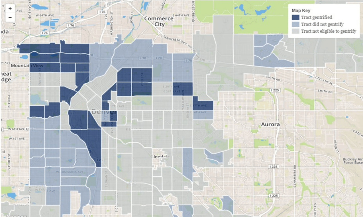
And here's a close up of redlined areas that later gentrified. There's a good deal of overlap.
So in the case of Lower Highlands, Sunnyside, Curtis Park, Lincoln Park and Baker, historically undervalued neighborhoods became areas where new investment could thrive.
And that new investment affects marginalized populations, whether it's renters being pushed out or businesses leaving. It's erasure, something that you can't quite see on a map, but that can hurt even more.
But the displacement isn't fully understood. As Erica Meltzer pointed out, "Gentrification doesn’t always bring displacement, and poverty itself creates a lot of instability."
And another redlined area of interest, Globeville and Elyria Swansea, hasn't gentrified yet.
Residents there deal with a litany of problems -- a legacy of air pollution and worries about a new National Western Center and a possible I-70 revamp abound. It's an area that Denver today associates with poor health outcomes, and it has a lot of ingredients for gentrification.
That leaves another big part of redlined Denver that we haven't talked about: Sun Valley, Valverde and parts of West Colfax and Villa Park.
There, it's possible to see a high proportion of households more likely to be housing-burdened.
At least 57 percent of Denver households earning less than $45,000 are moderately to severely burdened by a rent payment, according to a study from the Joint Center for Housing Studies of Harvard University. In West Denver, more households earn under $45,000 and more households are renting:
So among these different parts of the city, there hasn't been just one effect from redlining but many. And it's certainly hard to piece it all together, but at some point, you just have to start looking.
There is one correlation that I like in Denver's redlining maps, and it's either ironic or a little bit hopeful.
In Adrian Garcia's map of diversity, measured as areas of the city where you're more likely to see someone who doesn't look like you, most of the areas that were redlined now look to be among Denver's most diverse.
Correction: An earlier version of this story incorrectly identified the neighborhood of Sun Valley.