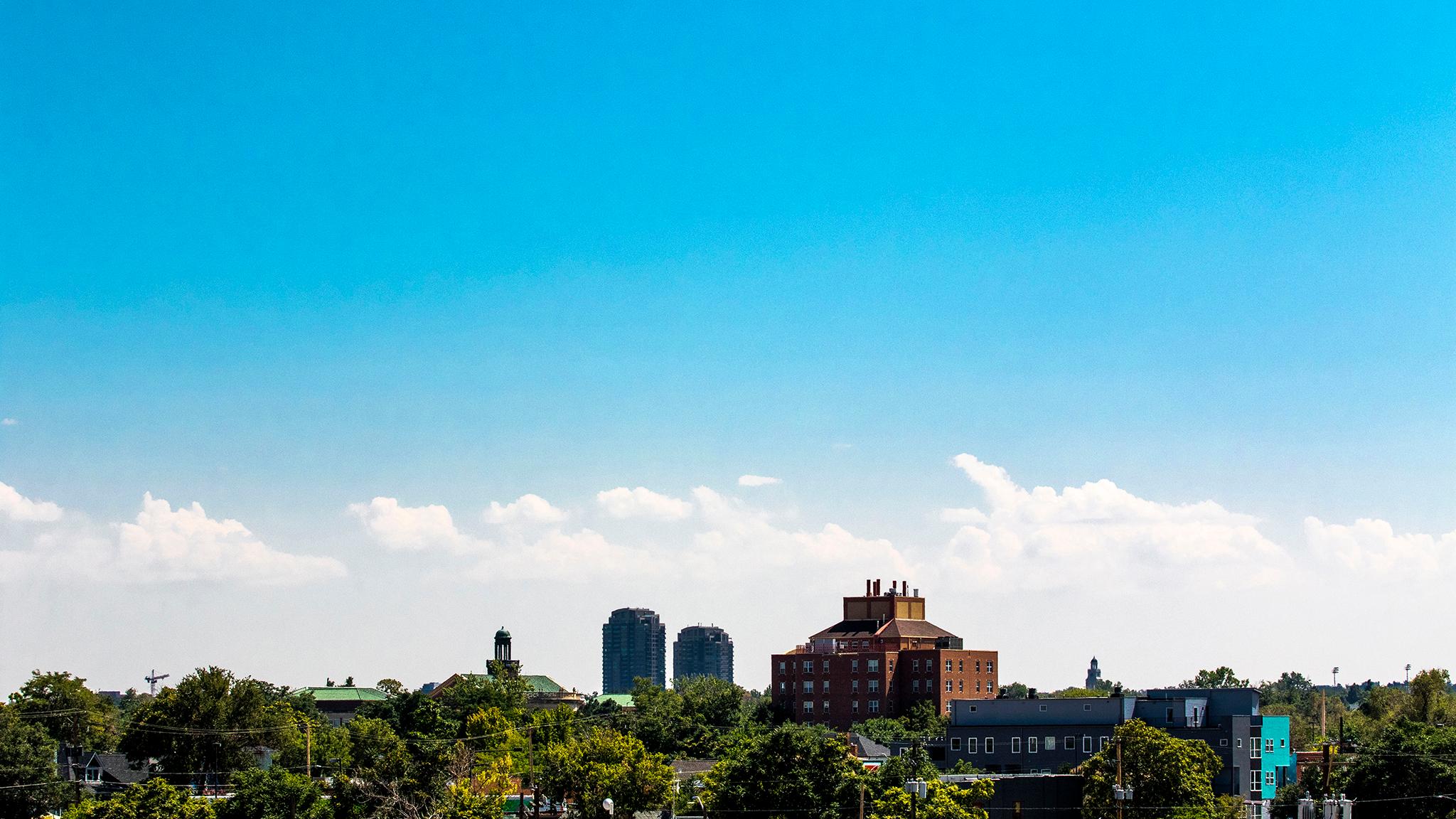
Denver's skies are bluer now that some rain broke the heat and clouds of smoke that hung over the city for weeks. Colorado is still wrestling with wildfires, but firefighters have recently made progress containing a few of them. Local air quality sensors show smoke has abated since readings peaked last week.
But some readers have asked which numbers they should use to decide when they might avoid the outdoors. Nathan was one. He noticed numbers on his Apple Watch, which come from Weather.com, did not match those listed on other sites. So we asked around to help you get the best info on the city's air.
How to check air quality, TLDR:
If you want a general idea about air quality in Denver, the EPA's AirNow portal or Colorado's air quality site will get the job done. They present average "air quality index" numbers, or AQI, measured in the city over a 24-hour period. This number won't show you peak pollution levels (more on this below).
If you want a general idea about air quality at 19 schools with city-run sensors, check out Denver's Love My Air program. Readings here present air quality as 30-minute rolling averages with easy-to-read color coding.
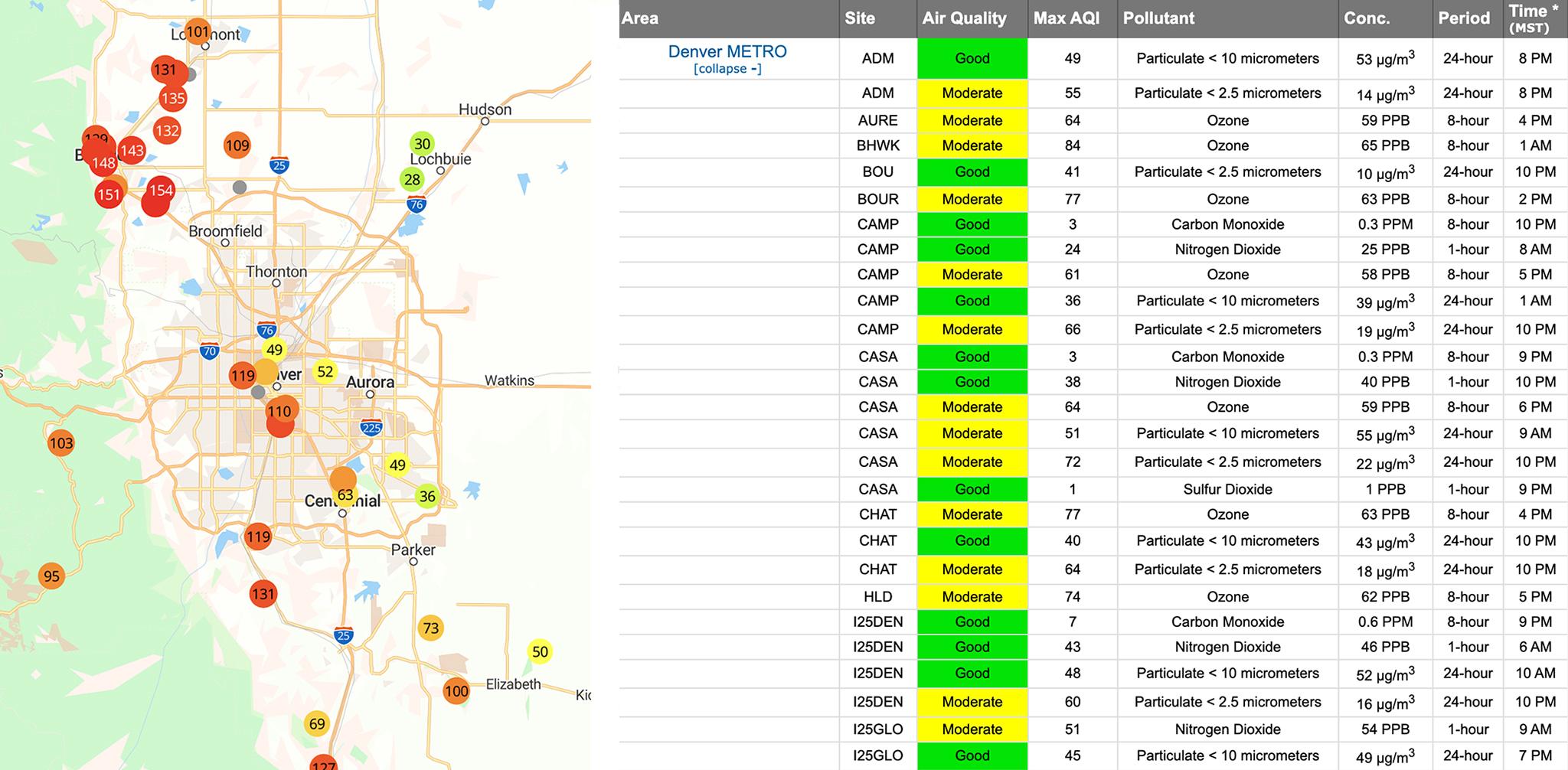
If you want to see AQI peaks in real time, or which corners of the city are breathing easier, take a look at PurpleAir's sensor map. You can see AQI averaged over time or as minute-to-minute readings. One caveat: The numbers may be a bit higher than official EPA readings.
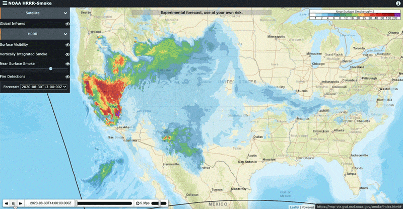
If you're curious about wildfire smoke specifically, you should check out a super-cool tool offered by the National Oceanic and Atmospheric Administration that predicts where wildfire smoke travels. Click "Near Surface Smoke" and then the play button in the bottom-left corner of the screen to watch how fires spread smoke nationwide. As of this weekend, Colorado's fires seemed to be belching less haze into the air, but Denver was still seeing some haze from California and Oregon.
And now for a deeper look.
Particulate matter pollution (PM) is measured in micrograms per cubic meter, but air pollution numbers are usually displayed as an "air quality index." The index, known as AQI, is a way to simplify data so non-scientists can better understand what's going on.
Joost de Gouw, a professor of chemistry and atmospheric sciences at the University of Colorado Boulder, described it as a "composite" of a bunch of readings. Basically, algorithms take levels of PM, ozone and other airborne pollution and sum them up in this simple AQI number based on what scientists think is generally healthy. If the equation spits out anything higher than 100, the air is considered unhealthy.
This is squishy for a number of reasons. For one, de Gouw said, health impacts vary between pollutants and people. AQI readings smash things like ozone and PM together and display a final number based on whichever is higher. Data sites don't often say which kind of pollution drives an AQI reading, so the number may obscure ways in which air may be unhealthy.
There isn't much research on what PM actually are and what they might do to you, de Gouw said. Haze hanging over the city can contain a bunch of chemicals that can impact different people in different ways. He said wildfire smoke tends to contain organic compounds while Denver's winter haze is usually made up of ammonium nitrate: "cars and cows, basically."
Relationships between health and pollution are complicated, de Gouw said, and researchers are still learning what bad air does to us.
The ways AQI numbers are presented also varies from source to source.
Denver air quality listed on Weather.com or the state health department's website will likely show different numbers because they average readings from different sensors over different periods of time.
And the stuff you breathe in one neighborhood is likely different than another. Michael Ogletree, who runs the city's air quality program, said averages help smooth things out to give people a generally accurate look at the city as a whole. There are only a handful of expensive state-run sensors in Denver, so averages help fill the gaps.
Ogletree said he likes AirNow, an EPA website that combines sensor data and presents AQI through a simple color spectrum.
He also helped create Denver's Love My Air program, which uses custom sensors to measure air quality at 19 local schools. The program doesn't use AQI and instead relies heavily on color-coded readings like AirNow. It's funded by a grant, which required Ogletree and the city to keep things simple. The colors pull from a "rolling 30-minute average" at each school.
Averages also help smooth readings over time. There's not a lot of science on short-term exposures to very bad air, Ogletree said. Most research deals with long-term exposures, so averaged AQI numbers remove extreme readings that persist for a short time and are less relevant to our understanding of health impacts.
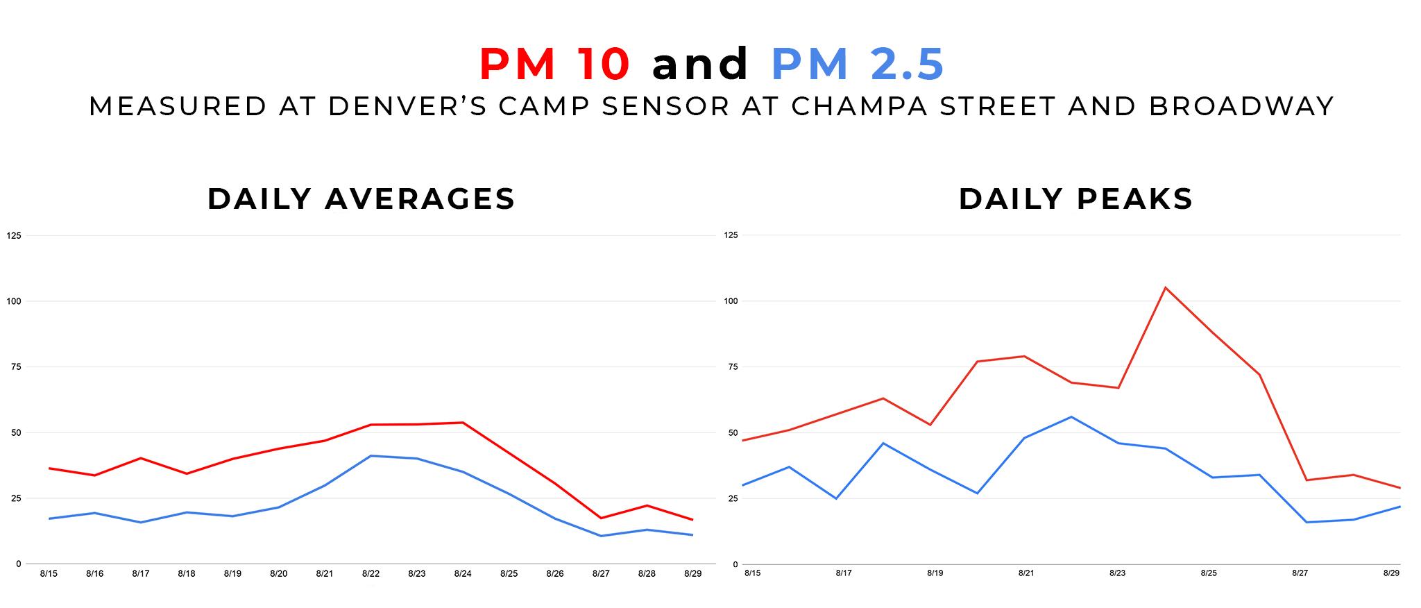
If you're interested in moment-to-moment readings, which include short-term spikes, PurpleAir is a good place to look. While it uses government data, PurpleAir's map also includes readings from a lot of cheap sensors that people use at home. Their website lets you see AQI numbers in real time across the city.
Cheap at-home devices can over-predict readings, and Ogletree said he's seen measurements as much as 50 percent over the EPA's very sophisticated sensors. Still, he said, the map can help illustrate how air pollution differs across the city, state and nation. Take the numbers you see with a grain of salt.
There's a new Denver-specific tool in the works just for you air quality obsessives.
Ogletree hopes that one day, Denverites will have as close a relationship with air data as we do with weather forecasts. To shepherd the city toward that goal, his department is working on an app that would keep residents updated about pollution near their location.
He said the dream is to "actively influence behavior change" so people avoid going outside when pollution is high or avoid idling their cars near schools where excess emissions could put kids at risk.
Ogletree told us the city is looking for a developer to build the app. He expects the first working draft to roll out early next year.

A daily relationship with air quality may become more important over time, as climate change makes large wildfires more and more likely.
Smoke from the fires themselves can also increase the amount of carbon in the atmosphere, according to Richard Wagner, a professor of meteorology at Metropolitan State University of Denver .
Ogletree said the city is aware that longer-term trends may impact health over time.
"It is something that we're thinking about. Especially with programs like Love My Air, we're trying to get ahead of that and trying to be a little bit more proactive about exposure to air quality," he said.