I got a message yesterday that filled me with dread and joy:
"I’m one of the 3 designers who created the Denver Broncos brand," wrote Rick Bakas.
See, I have made a minor hobby of mocking the NFL's most fearsome horse. I have written about its lack of teeth. I have described the full-body version of the logo as a disturbing and succulent seahorse.
I was mildly mortified to read Bakas' tweet -- I'd never really thought about the Broncos horse being designed by an actual person -- but I wasn't ready to apologize for my smarm, so I figured I'd at least get my questions answered.
First, the teeth. I sent Bakas my illustration of the Broncos horse with added dentures and asked his opinion.
"What do you think of my version with teeth? Too much detail?" I wrote.
Bakas responded politely.
Embroidery -- it'll get you.
Next, I asked about the big thing: the full-body variant.
I previously had complained that it's just weird to see the whole horse, and I had criticized the way that its body is really just an extension of its neck, and I also had quoted some guy about how it looks like it just saw a scary spider.
What did Bakas think about it in retrospect, I asked?
Bakas replied -- and I'm combining his tweets here, but it's verbatim --
"I helped design it and have read your thoughts on it. There's 2 things to know:
1. It was done at the end of the project rather hastily
2. The whole emphasis of the main logo was the neck muscles. The body goes where the head and neck go, that's where the power comes from."
The ceiling is the roof; the power is the neck. The full-body logo was supposed to capture that power, which is why the full horse is mostly a coil of neck muscle.
Bakas also added by email that "we didn’t want a crotch shot," so they ended up with what "looks like a weird pose." I get that. Look at the airport horse. Roger Goodell wouldn't stand for that.
And they only had a few days to finish the alternate mark, compared to a few months for the main logo, Bakas added -- not an easy task on such short order.
Looking at the logo again...
Bakas, who was born and raised in Denver, tells me that he is a lifelong Broncos fan. He was just 26 and working as an assistant designer at Nike when he was assigned to the Broncos project.
Looking back over their work, I think that the horse's head itself does look mighty powerful. It's also instantly recognizable, and it takes only a few bold lines to convey that this is a horse that will outrun you, trample you and possibly eat you with its beak.
“I want a horse that looks like it’s going to kick your ass," Broncos owner Pat Bowlen had reportedly told the designers. Brand goals fulfilled.
Bakas told me that the horse is white because it is a symbol for the "ghost horse of the plains," he wrote. "It represents a stallion so spirited, it can’t be broke or tamed by man. Also something we tried to convey in the full body horse."
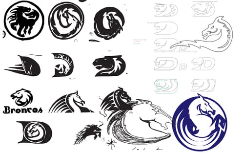
They sketched hundreds of concepts along the way. "Some had elements of a serpent while others have the explosive flow of a wave," according to Bakas.
And, like the man said, they realized that "a horse's power comes from its neck. Wherever the head and neck go, the body follows."

I maintain that the full-body version is still kind of funny.
Yet I can't help but feel the mild shame that comes with being politely confronted by a person you have been shit-talking.
Granted, Rick Bakas has 95,000 Twitter followers, owns the cannabis news site Weedhorn and also designed the University of Oregon Ducks brand, so I doubt he feels that badly -- but I do respect that he handled my juvenile arts criticism rather gracefully.
"We’ve had so many people criticize the brand over the past 20 years that nothing phases me any more," he wrote.
"It was designed to be a timeless brand, and after 20 years I’d say it’s still looking good."
Anyway, if you'd like to email me your own illustration of the Broncos horse or call me an unfunny nerd, go ahead and hit the inbox.