Every so often, when I'm deep in some report or another, I find a map of Denver. When they really capture something interesting, I'll share them. This week's example uses a simple bit of math to quickly show how different parts of the city have developed.
Each block of Denver is shaded based on its size. The smallest blocks get a richer shade of green. The theory behind this map is that smaller blocks are more walkable.
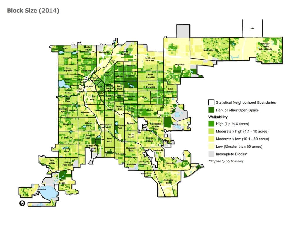
The heart of downtown, along with the residential neighborhoods immediately surrounding it, are rated as the most walkable in this system. (You can find a slightly larger version of the full map on page 88 of this PDF.)
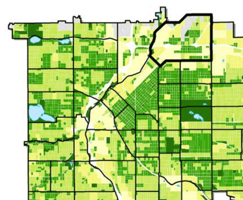
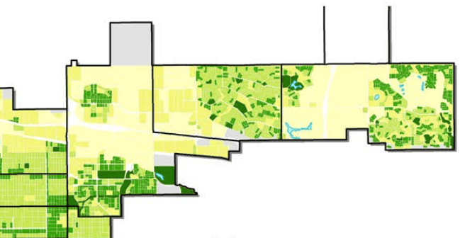
In the east and northeast, neighborhoods like Stapleton and Park Hill, along with some of the Colfax neighborhoods, form clusters of smaller blocks.
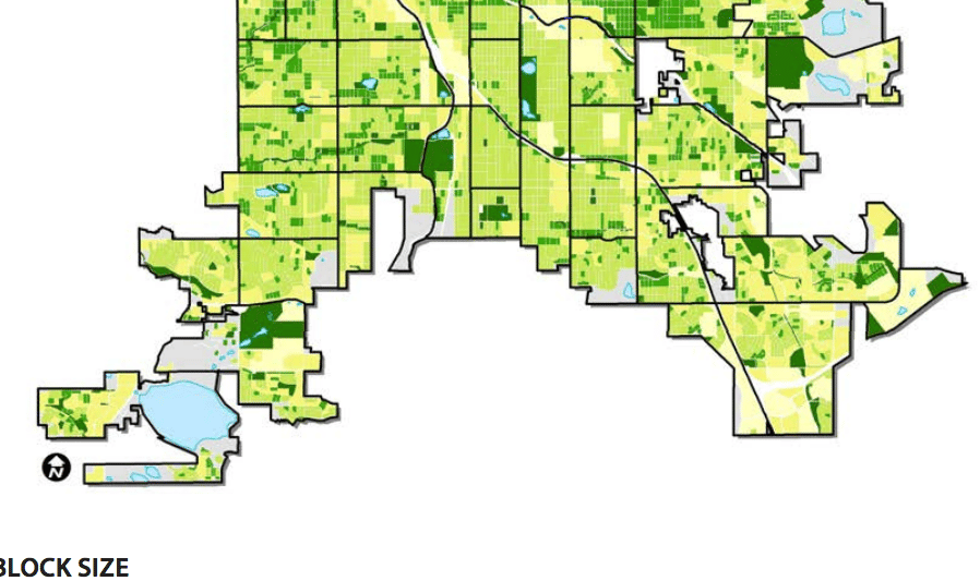
And in south Denver, the blocks get bigger and bigger as the city shifts into the curvy cul-de-sacs of suburbia. What struck me about this map, though, was that most of the city does stick to the traditional straight-line pattern, until you get into its far corners.
Bonus map!
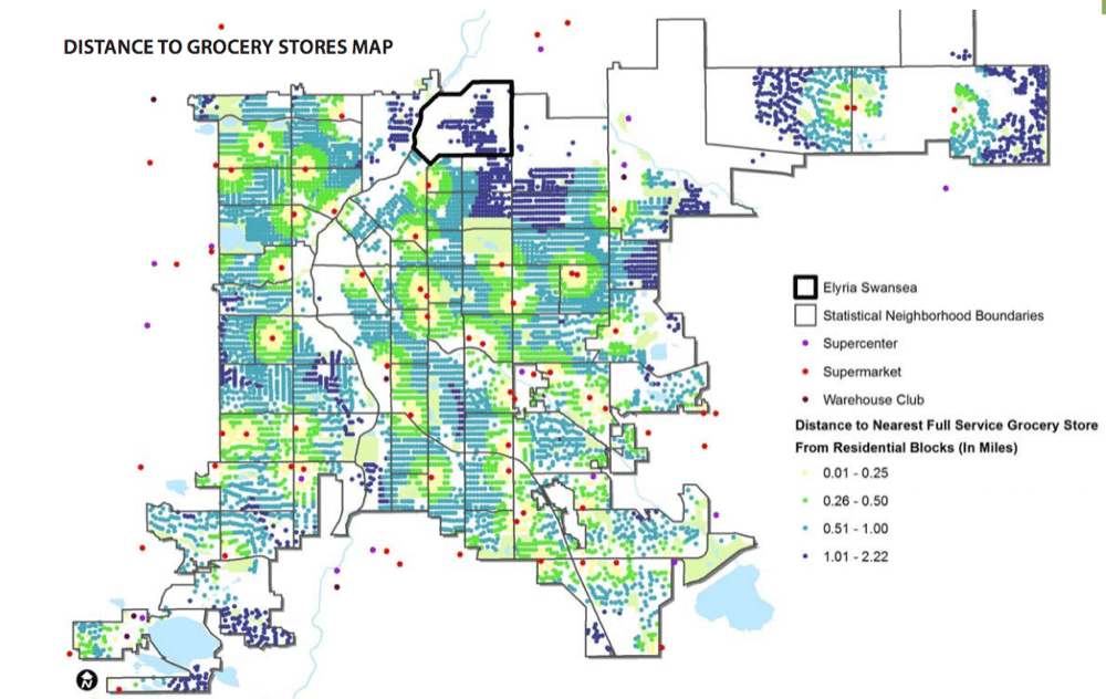
Another common measure of walkability is access to a grocery store. This map from a 2015 report shows grocery locations and highlights the areas within their walking areas. However, it will have changed a bit as new stores have filtered into places like Montbello.
Got a map?
Send me an email. Or just email me anyway. Or don't.