Election Day is coming back in the form of the June 6 runoff, people, which means it's still a good time to talk municipal politics.
The subject today: What do we know about our last election day as a handful of city races head towards their run-offs?
We took a look at Denver Elections' final, "official" results, which are now available at the precinct level. We combined that info with neighborhood-level data on race, political party registration, turnout and age to see how candidates fared with different pools of voters...
...then, we charted everything!
If you're just interested in some graphs, explore this widget.
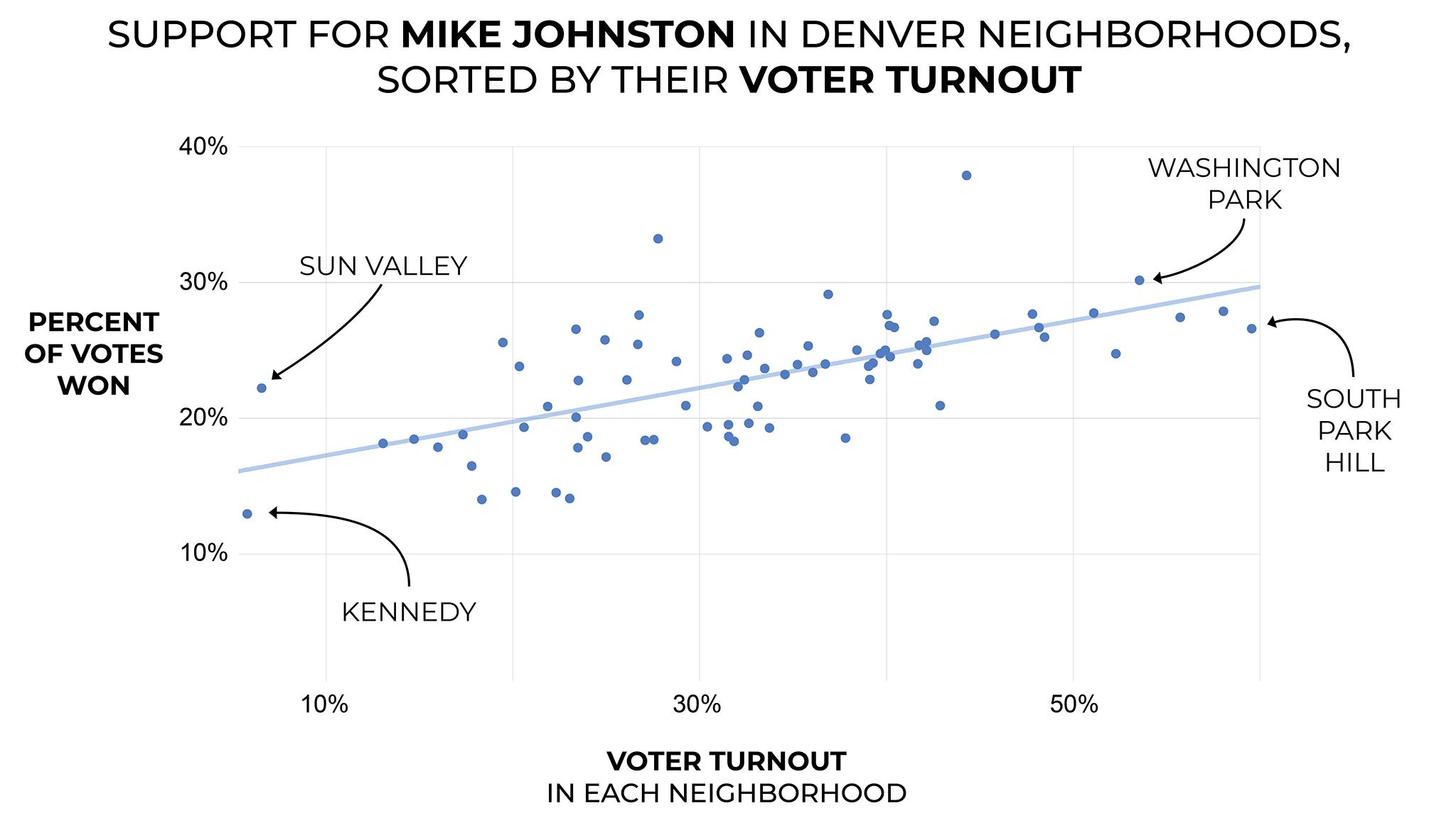
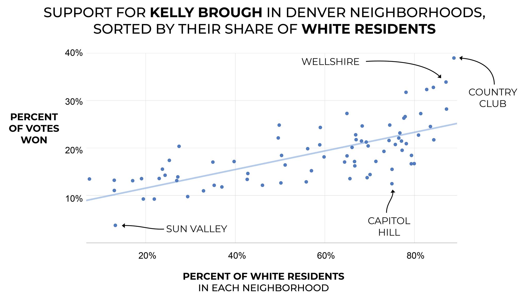
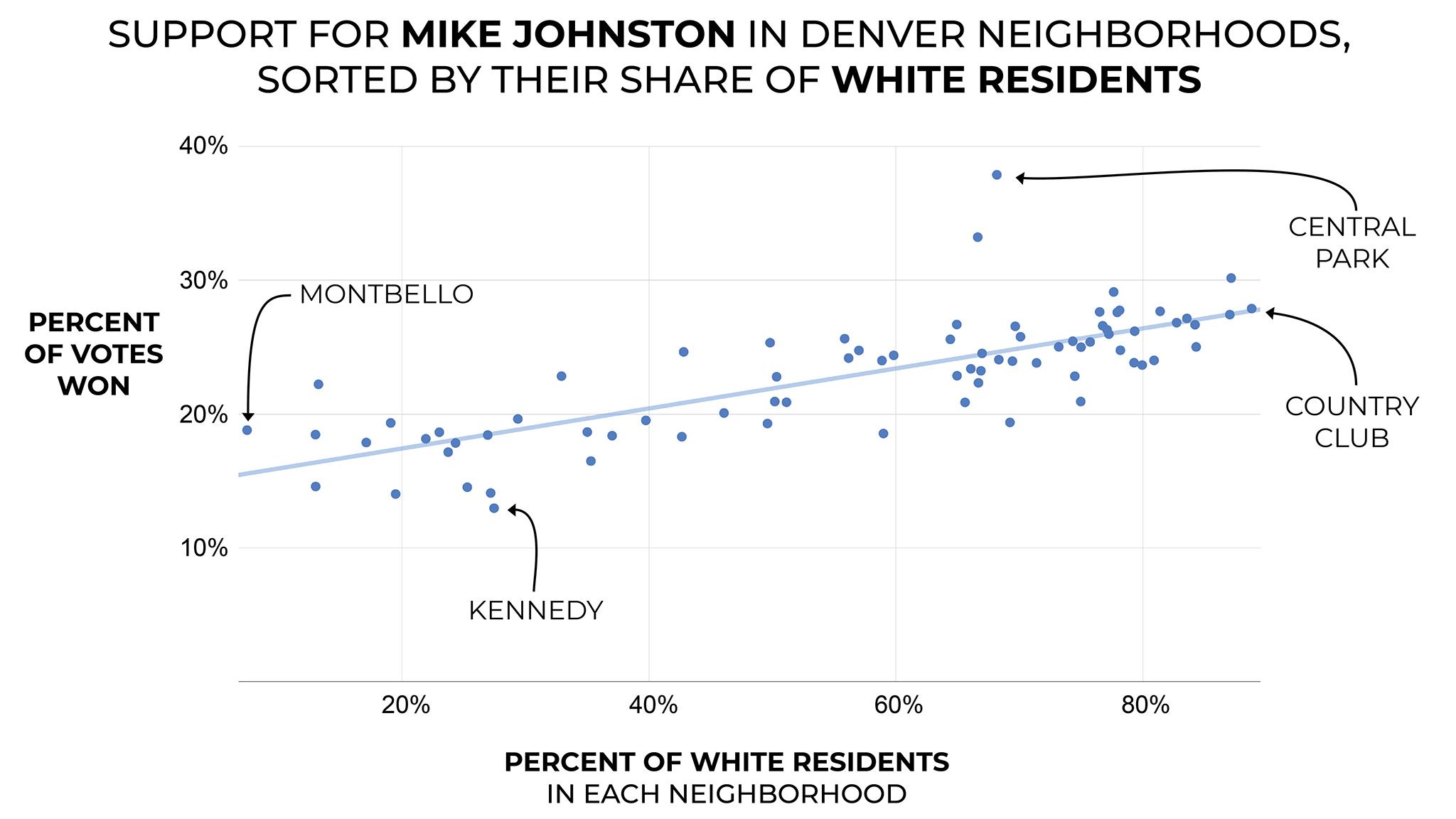
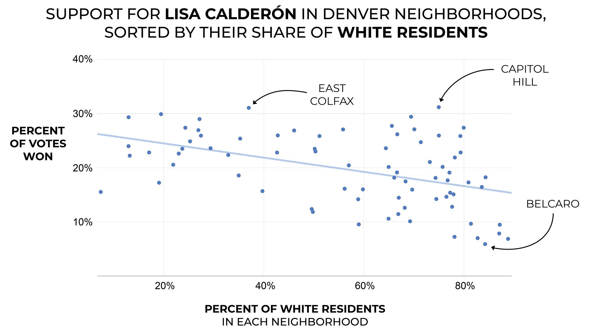
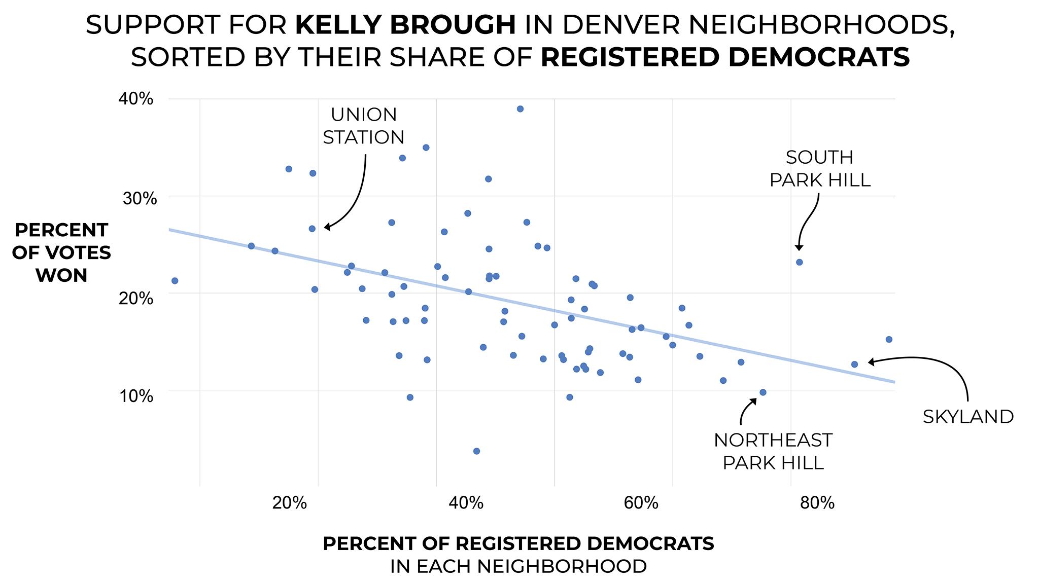
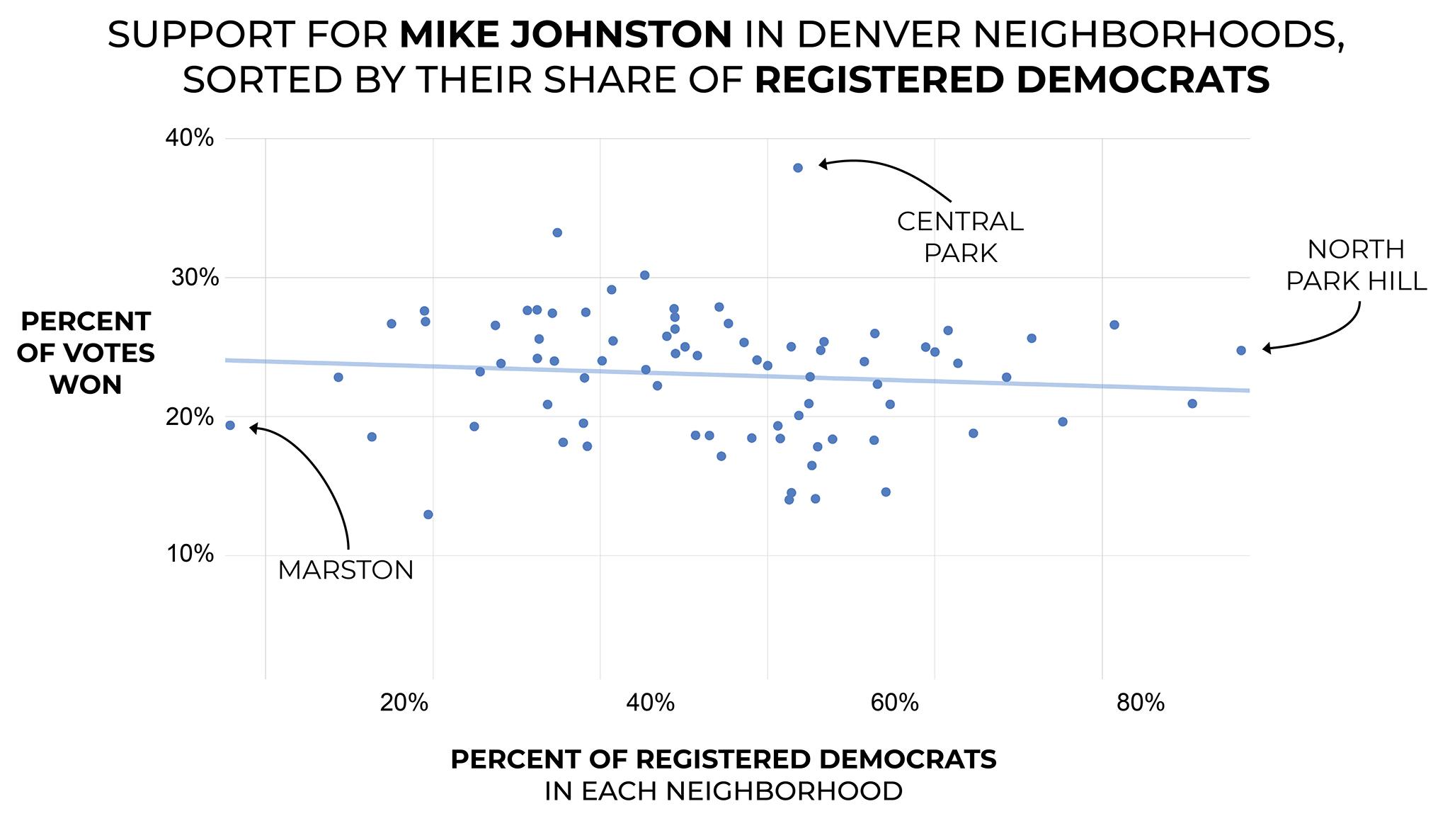
Each dot represents a neighborhood. Its position along the vertical axis represents the percent of votes won by a given candidate in that neighborhood; its position along the horizontal axis represents the percent of a given population within that neighborhood.
Click the purple words to change the parameters. You can drag the chart and zoom. You can also click here to see this in your full browser.
Let's begin with who won where:
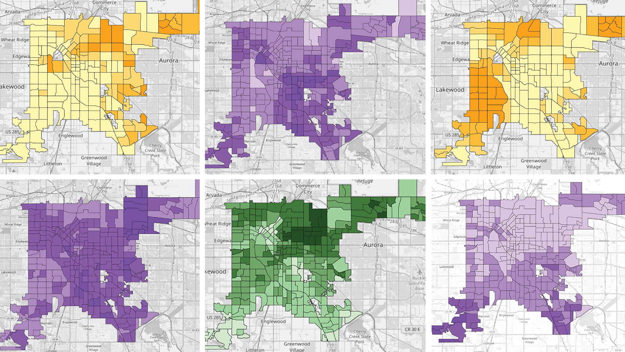
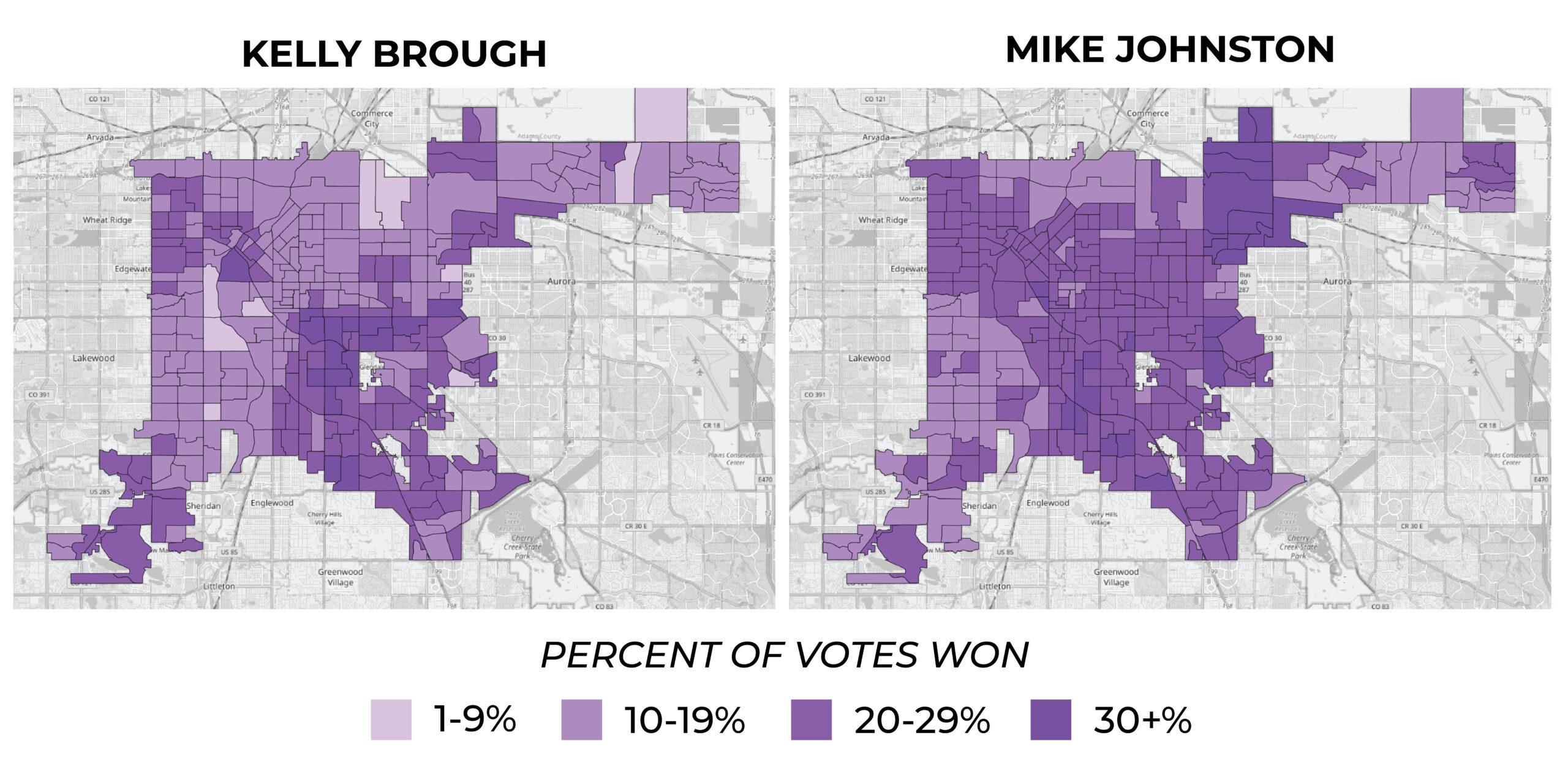
The city's precinct-level data allows us to finally see how candidates fared across neighborhoods. Here are maps for the mayoral runoff candidates, Mike Johnston and Kelly Brough:
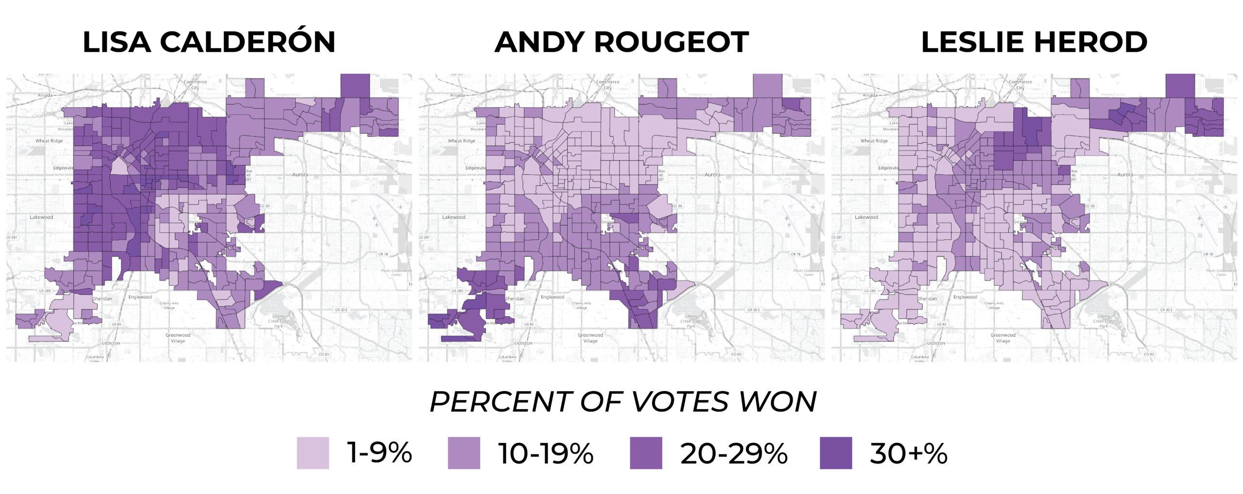
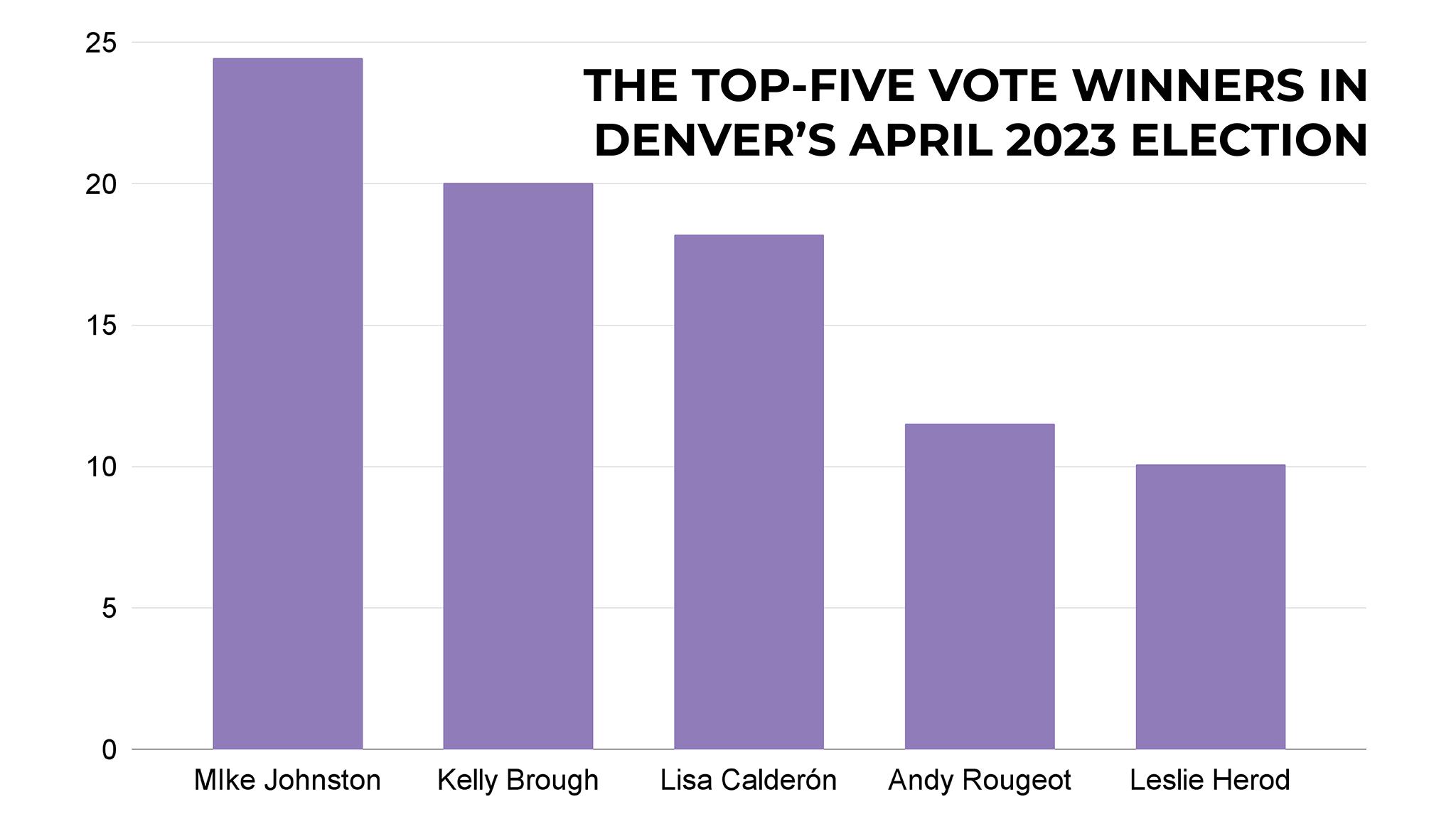
And here's data on Lisa Calderón, Andy Rougeot and Leslie Herod, who won third, fourth and fifth places, respectively:
Finally, just to remind you, here's how everyone did:
Now, let's dig into these geographies:
Some readers may look at the maps for Johnston and Brough and see a familiar pattern, one that places more gravity on the city's northwest and southeast corners. Former Denverite reporter David Sachs called it the "Inverted L," and the pattern applies neighborhood racial makeups, tree cover and more.
It appears the Inverted L's socioeconomic boundaries also applied to our April election.
Turnout
Data on the number of registered voters who actually voted follows the L.
That tracks, according to Robert Preuhs, chair of Metro State University of Denver's political science program. Before the election, he told us some reasons why socioeconomics tends to be correlated with participation: basically, if you're struggling to pay your bills and working all the time, you may not be so plugged into a mayoral race. Also, he told us, renters tend to participate at lower rates, since they move more often and likely care less about property values.
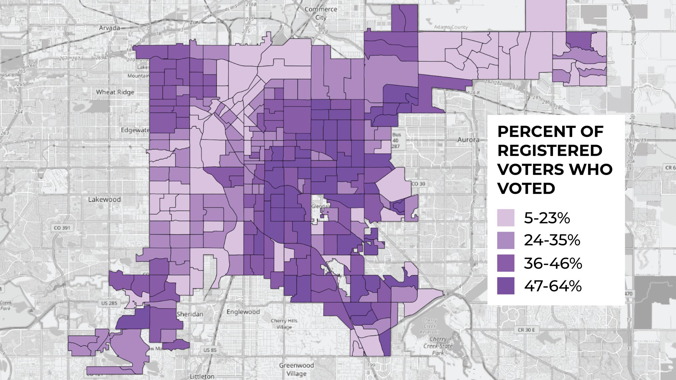
Both Johnston and Brough performed better in neighborhoods that turned out. Calderón and Herod's support fell in neighborhoods with higher voter turnout.
Race
Surprise! Denver's race data follows the Inverted L, and our voter turnout map.
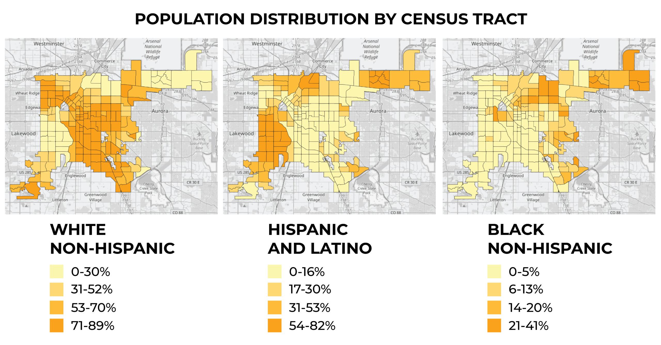
Like turnout, our analysis on race also shows that Johnston, Brough and Rougeot performed better in neighborhoods with more white, non-Hispanic residents. In fact, Denver's Country Club neighborhood, the whitest in the city, also gave the most support to Brough.
Conversely, Calderón and Herod did worse in neighborhoods with more white voters.
Political Party Registration
Republicans are widely outnumbered in Denver County, but we do have some areas where they tend to congregate. On the other hand, there are more unaffiliated voters in the city than Republicans or Democrats - almost 44%, according to 2021 registration data from Colorado's Secretary of State.
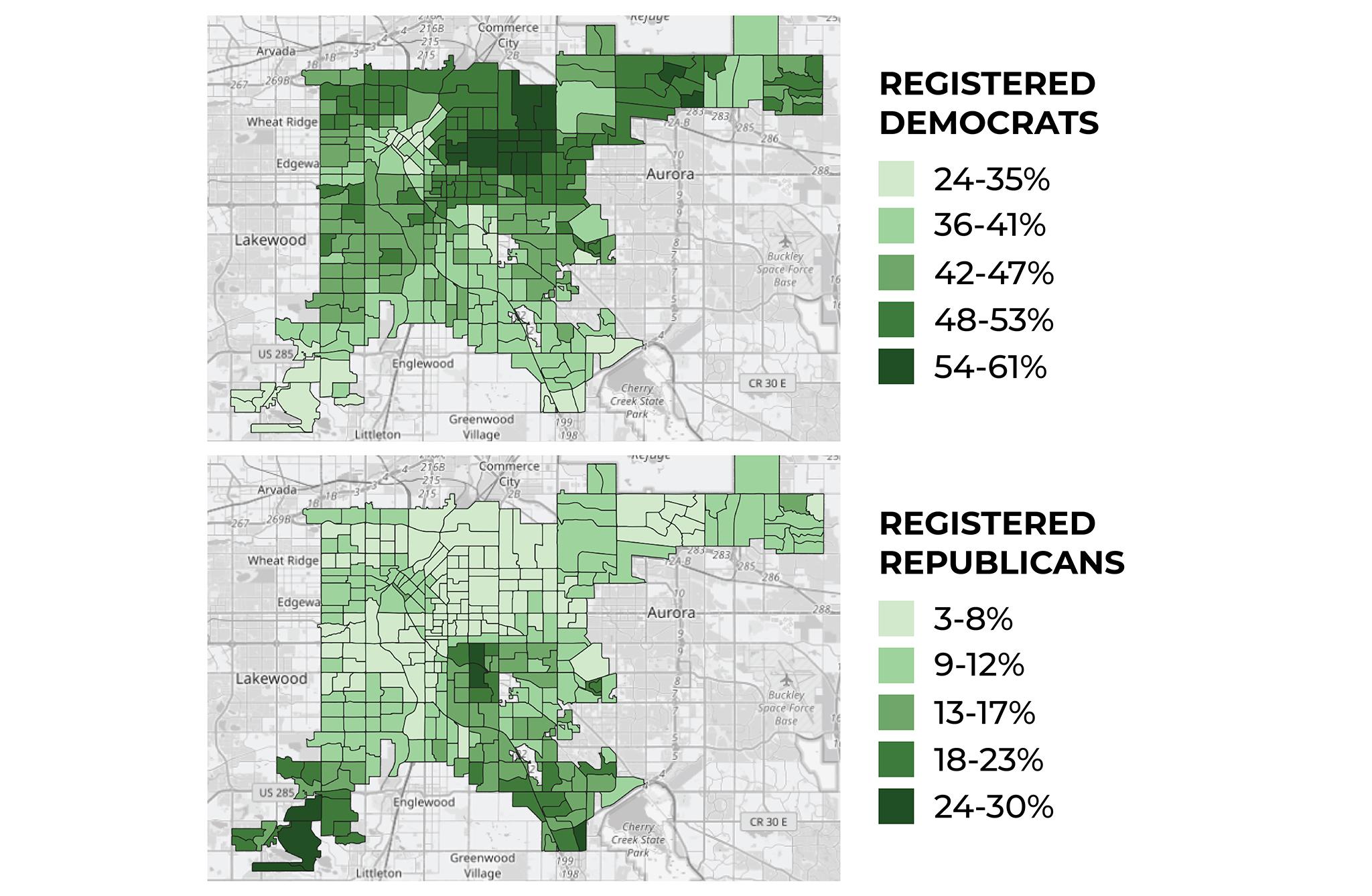
Unsurprisingly, Rougeot, the only registered Republican in the mayoral race, performed best in neighborhoods with more Republicans. Brough's results trended towards Republican support, too, and appeared to fall in neighborhoods with more registered Democrats.
Calderón performed better with Democrats and unaffiliated voters. While it appears Johnston did slightly worse in areas with more registered Democrats, the slope of his trendline was pretty close to flat.
So what does it all mean?
Both MSU professor Preuhs and Paul Teske, dean of University of Colorado Denver's school of public affairs, said these maps are probably indications of where Brough and Johnston are spending their time and money before the runoff.
Their goal, they said, is to hit the areas where they did poorly, or where people didn't participate. People who voted for them already aren't likely to change their minds, Teske said, so the trick will be convincing other groups to pitch in. According to our analysis, they'll need to focus on people of color, people who identify as left of center and people in neighborhoods with lower turnout.
An easy way to do that, Preuhs said, is get endorsements from people who have sway in some those communities.
"To fill in that map," he said, "because endorsements are nice low-cost information for voters to really decide who they're going to go for."
The first flurry of endorsements have come in, and both candidates seem to be buddying up with figures who might help them address their blind spots. Johnston's first big endorsement came from former Mayor Federico Peña; Brough's came from former Mayor Wellington Webb and former state lawmaker Wilma Webb.
Teske said Brough has a little bit of an edge with older voters, who appeared to throw support her way. They're more likely to turn out for her again, he told us.
On the other hand, he added that Johnston appeared to do decently with groups across a number of demographics and achieved a wide geographic spread, good signs for his campaign.
"If I were Mike, I'd try to make sure the folks I'm closer to on the left, who voted for Lisa and Leslie and a handful of others, do get out and get inspired to vote," he said. "And if I were Kelly, I'd double down on the solid older voters."
Two more things outside of the mayoral race:
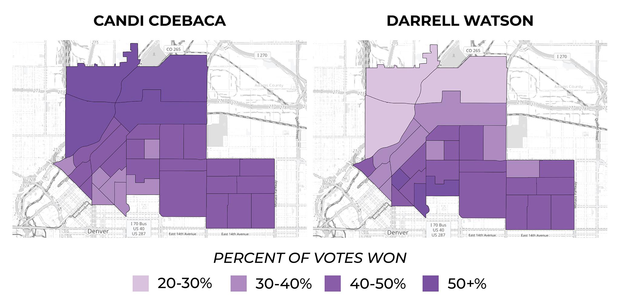
First, check out this map of support for District 9 incumbent Candi CdeBaca and her runoff challenger, Darrell Watson. While Elyria Swansea had fairly low turnout, they really went for CdeBaca. We're not displaying results for Kwon Atlas, a second challenger who received 12% of the vote (CdeBaca and Watson both got just over 40%), but it's worth saying his support straddled the geographic north-south line separating his opponents.
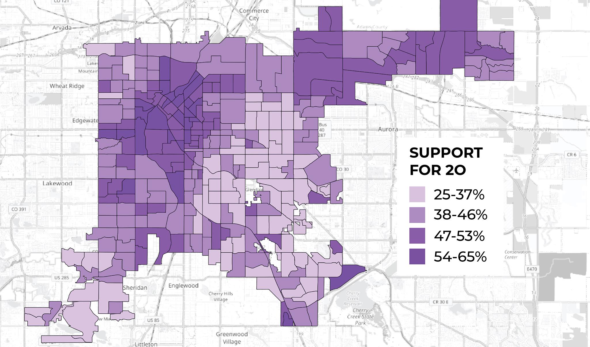
Second, check out this map of support for 2O, the ballot measure that would have allowed Westside Partners to move forward on their plan for the Park Hill Golf Course. While votes were geographically segregated, our analysis of the results show support split generally evenly across demographics.